Hello tech enthusiasts!
From the rustic charm of a village mela to the glitz of a Delhi mall, there’s an evolution in everything. But have you ever wondered how the web, our virtual ‘mohalla’, has changed over time? From plain text pages to vibrant, interactive experiences, web design has come a long, long way. Let’s jump onto this digital train and journey from the past to the present.
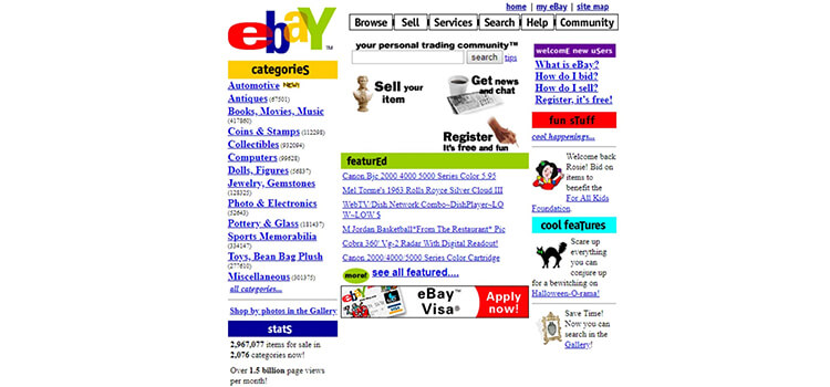
Picture a world with no colours, just black and white – that was the internet of the early 90s. Plain text, hyperlinks, and lots of scrolling. Remember the stories of the old ‘patwari’ ledger? Quite similar!
Basic HTML: The foundation stone.

As the 90s progressed, our web world started seeing more colours, images, and tables. Sites became visually appealing, a bit like switching from a simple kurta to a vibrant Punjabi suit.
Introduction of CSS: Allowing better control over design.
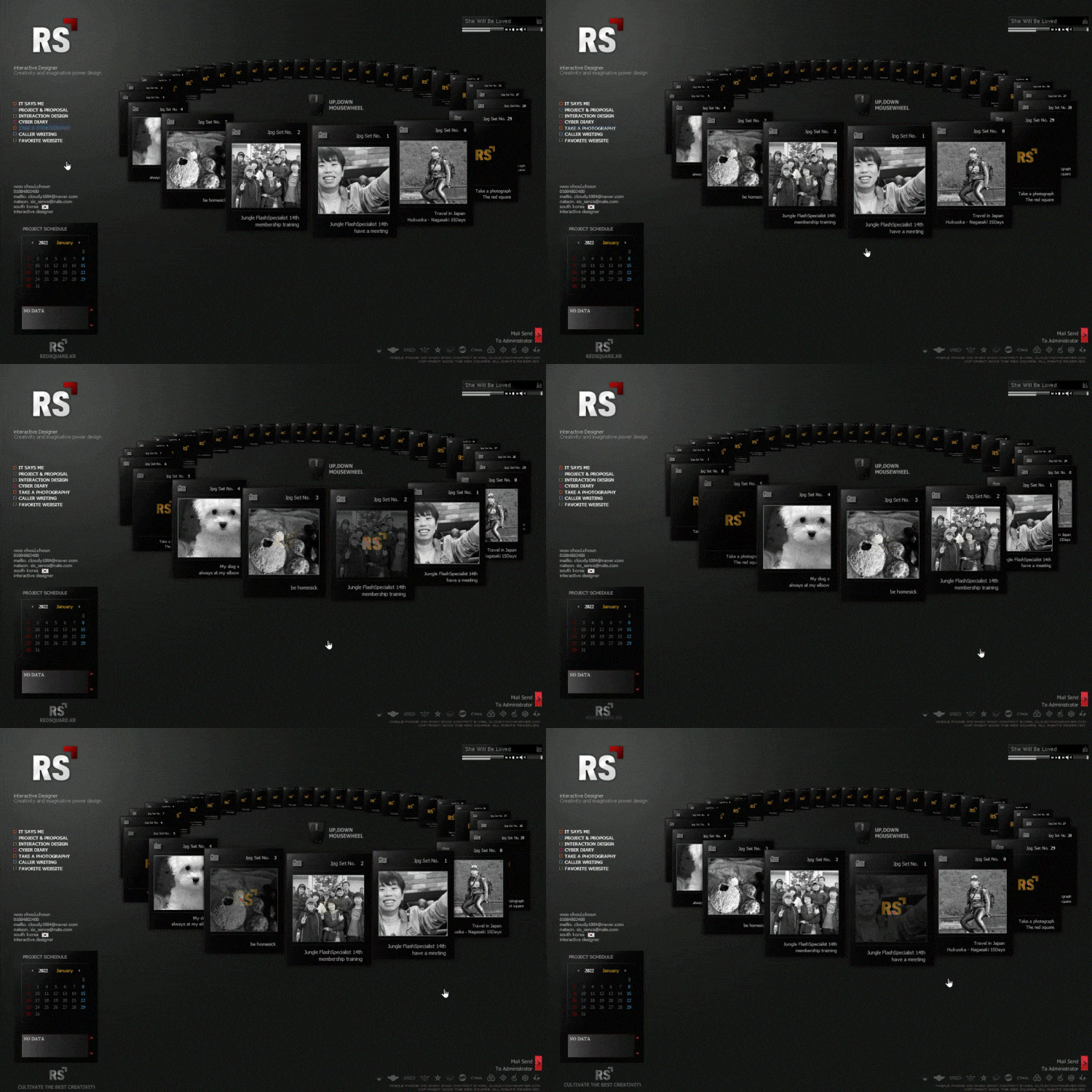
Just like the dazzling lights during Diwali, Flash brought animation, video, and interactivity. Websites started dancing and singing, mirroring the energy of a Punjabi wedding.

With families transitioning from bulky desktops to sleeker laptops, websites had to adapt. Just like tailoring your old oversized shirt to fit you perfectly.
Liquid Layouts: Websites that adjusted according to screen size.
Imagine trying to park a truck in a scooter’s space. That’s what older websites felt like on mobile. Enter responsive design. Websites now felt at home, whether on a desktop, tablet, or mobile.
Introduction of Bootstrap: Making web design adaptable and responsive.

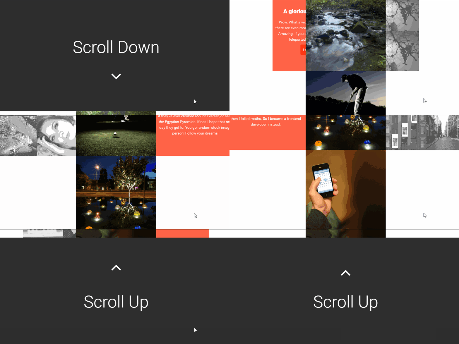
An illusion of depth as you scroll. One page that tells a complete story. Just like listening to a heartfelt ghazal, where every line unveils a new emotion.

The crowded streets slowly gave way to open, airy malls. Similarly, cluttered websites paved the way for cleaner, more organized ones. Crisp, clear, and to the point.
Whitespace and Bold Typography: The new heroes.
Modern-day websites now have the allure of a peaceful Amritsar night, with lights (or designs) that dance gracefully.
Benefits: Eye-friendly, energy-saving, and outright classy!
The journey of web design, as shown by Gemini Geeks, is like the growth of a tree – from a simple seed to a sprawling entity, offering shade and fruits. It’s more than mere visuals; it’s about usability, interaction, and experience. From the simple days of static HTML to the modern, intuitive designs of today, web design has indeed been a yatra worth reminiscing.
Whether you’re a business from Ludhiana or London, understanding this evolution helps you adapt and create a site that resonates with today’s audience. After all, in the digital world, your website is your identity.
Stay tuned for more insights and trends from the world of web design, and remember, in this ever-evolving digital ‘bazaar’, there’s always something new around the corner!
Reach out to us and let us build an amazing website for your business.
Call Us Now on +91 9041001555 or send us an email to admin@thegeminigeeks.com to discuss your project